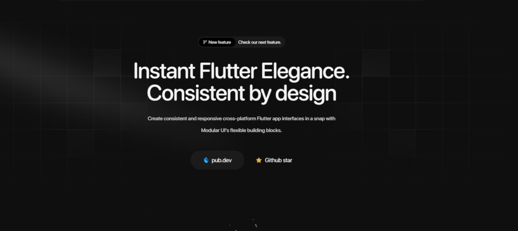
Flutter Responsive UI – Craft beautiful, accessible, and responsive Flutter UIs with a Modular-UI Design-inspired component library
How to use
Installation
Run this command in your terminal
flutter pub add modular_ui
Import
Add this line to import the package.import ‘package:modular_ui/modular_ui.dart’;
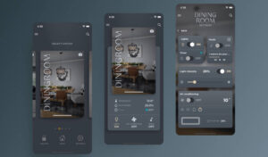
Our Widget Catalog
Avatar
Breadcrumbs
Button
- Primary Button
- Secondary Button
- Gradient Button
- Loading Button
- Outlined Button
- Text Button
- Block Level Buttons
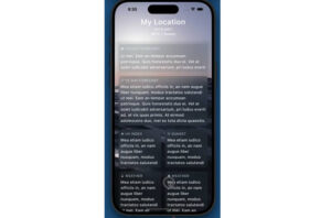
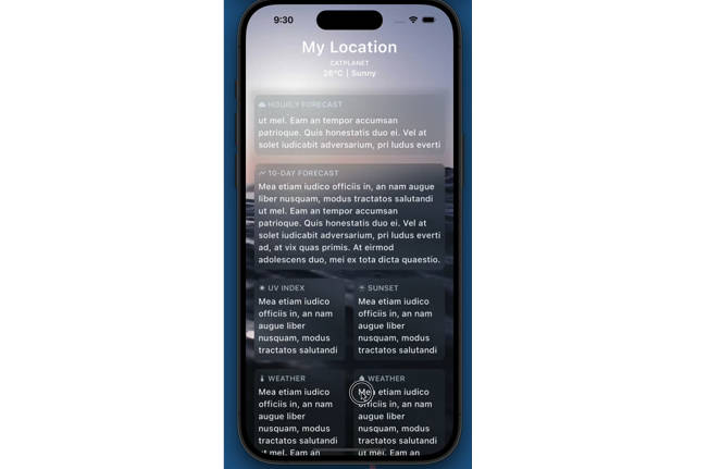
Card
- Simple Card
- Primary Card
- Profile Card
- Sign in Card
- Sign up Card
- Pricing Card
- Blog Card
Checkbox
Carousel
Dialog
Footer
Input Fields
List Tile
Radio Button
Rating Bar
Slider
Tab View
Switch
Code Samples
Buttons
Primary Button MUIPrimaryButton( text: “Primary Button”, onPressed: () => onButtonPressed(“Primary Button”), ),
Cards
Primary Card MUIPrimaryCard( title: ‘UI/UX Review Check’, description: ‘The place is close to Barceloneta Beach and bus stop just 2 min by walk and near to “Naviglio” where you can enjoy the main night life in Barcelona’, image: Image.network( ‘https://images.unsplash.com/photo-1540553016722-983e48a2cd10?ixlib=rb-1.2.1&ixid=MnwxMjA3fDB8MHxwaG90by1wYWdlfHx8fGVufDB8fHx8&auto=format&fit=crop&w=800&q=80’, fit: BoxFit.cover, ), buttons: [ MUIPrimaryButton( text: ‘Read More’, onPressed: () {}, ), ], ),
Carousal
Primary Carousal MUICarousel( images: [ “https://github.com/shadcn.png”, “https://github.com/shadcn.png”, “https://github.com/shadcn.png”, “https://github.com/shadcn.png”, “https://github.com/shadcn.png” ], indicatorType: CarouselIndicatorType.dot, duration: Duration(seconds: 2), ),
For more code smaples, you can head on to your documentaion.
Features
- Comprehensive Modular-UI Design components: Build modern and feature-rich interfaces with a wide range of buttons, cards, forms, navigation elements, and more.
- Highly customizable: Tailor components to your exact needs with extensive styling options.
- Responsive design: Ensure optimal UI experiences across different screen sizes.
- Accessibility focus: Built with accessibility in mind, adhering to best practices.
- Lightweight and performant: Efficiently crafted for smooth user interactions.
Additional Features
- Custom themes and color palettes: Define your own visual style for a cohesive look.
- Dark mode support: Seamlessly adapt your UI to user preferences.
Contributing
Calling on all the trendsetting Flutter enthusiasts! ❤️🔥 Join forces as we pioneer the creation of the ultimate, expansive, and seamless UI Library for Flutter. Let’s make waves together! 🚀 Please refer to our contribution guidelines for details and don’t forget to drop a Hi at discord
GITHUB REPOSITORY
https://github.com/opxica/modular-ui
- All rights reserved to the respective owners/authors